View Details
ナビゲーション
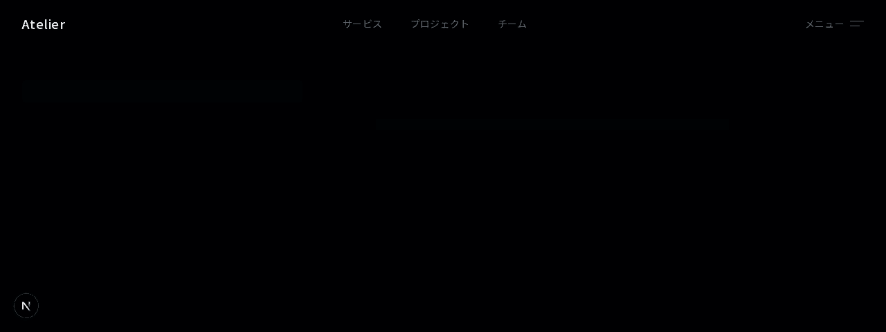
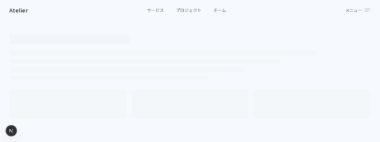
フローティングナビゲーション
#ミニマル#ガラスモーフィズム+1
ロゴ・ナビリンク・CTAを三分割で配置したモダンなヘッダーナビゲーション。backdrop-blurで半透明効果を実現
1"use client";23import { useState } from "react";4import Link from "next/link";56const navLinks = [7 { label: "サービス", href: "#" },8 { label: "事例", href: "#" },9 { label: "チーム", href: "#" },10 { label: "ブログ", href: "#" },11];1213export function NavigationSplit001() {14 const [mobileMenuOpen, setMobileMenuOpen] = useState(false);1516 return (17 <header className="sticky top-0 z-50 w-full border-b border-border bg-background/95 backdrop-blur-sm">18 <nav className="mx-auto max-w-7xl px-4 sm:px-6 lg:px-8">19 <div className="flex h-16 items-center justify-between">20 {/* 左: ロゴ */}21 <div className="flex shrink-0 items-center gap-3">22 <div className="flex h-7 w-7 items-center justify-center rounded-md border border-border">23 <div className="h-1.5 w-1.5 rounded-full bg-foreground/60" />24 </div>25 <Link26 href="#"27 className="text-sm font-medium tracking-wide text-foreground"28 >29 Atelier30 </Link>31 </div>3233 {/* 中央: デスクトップナビゲーション */}34 <div className="hidden items-center gap-1 md:flex">35 {navLinks.map((link) => (36 <Link37 key={link.label}38 href={link.href}39 className="rounded-md px-4 py-2 text-[13px] tracking-wide text-muted-foreground transition-colors duration-200 hover:bg-muted hover:text-foreground"40 >41 {link.label}42 </Link>43 ))}44 </div>4546 {/* 右: CTA + モバイルメニュー */}47 <div className="flex items-center gap-4">48 <Link49 href="#"50 className="hidden text-[13px] tracking-wide text-muted-foreground transition-colors duration-200 hover:text-foreground md:block"51 >52 ログイン53 </Link>54 <div className="hidden h-4 w-px bg-border/60 md:block" />55 <Link56 href="#"57 className="hidden items-center gap-2 rounded-md border border-foreground/15 bg-foreground px-4 py-2 text-[13px] font-medium tracking-wide text-background transition-all duration-200 hover:bg-foreground/90 md:inline-flex"58 >59 お問い合わせ60 <svg61 className="h-3 w-3"62 fill="none"63 stroke="currentColor"64 viewBox="0 0 24 24"65 >66 <path67 strokeLinecap="round"68 strokeLinejoin="round"69 strokeWidth={2}70 d="M17 8l4 4m0 0l-4 4m4-4H3"71 />72 </svg>73 </Link>7475 {/* モバイルメニューボタン */}76 <button77 className="flex h-8 w-8 items-center justify-center rounded-md border border-border text-muted-foreground transition-colors duration-200 hover:text-foreground md:hidden"78 onClick={() => setMobileMenuOpen(!mobileMenuOpen)}79 >80 <svg81 className="h-4 w-4"82 fill="none"83 stroke="currentColor"84 viewBox="0 0 24 24"85 >86 {mobileMenuOpen ? (87 <path88 strokeLinecap="round"89 strokeLinejoin="round"90 strokeWidth={1.5}91 d="M6 18L18 6M6 6l12 12"92 />93 ) : (94 <path95 strokeLinecap="round"96 strokeLinejoin="round"97 strokeWidth={1.5}98 d="M4 6h16M4 12h16M4 18h16"99 />100 )}101 </svg>102 </button>103 </div>104 </div>105 </nav>106107 {/* モバイルメニュー */}108 {mobileMenuOpen && (109 <div className="border-t border-border bg-background px-4 pb-6 md:hidden">110 <div className="flex flex-col gap-1 pt-4">111 {navLinks.map((link) => (112 <Link113 key={link.label}114 href={link.href}115 className="rounded-md px-3 py-2.5 text-sm tracking-wide text-muted-foreground transition-colors duration-200 hover:bg-muted hover:text-foreground"116 >117 {link.label}118 </Link>119 ))}120 </div>121 <div className="mt-4 border-t border-border pt-4">122 <div className="flex flex-col gap-2">123 <Link124 href="#"125 className="rounded-md px-3 py-2.5 text-sm tracking-wide text-muted-foreground transition-colors duration-200 hover:text-foreground"126 >127 ログイン128 </Link>129 <Link130 href="#"131 className="inline-flex items-center justify-center gap-2 rounded-md bg-foreground px-4 py-2.5 text-sm font-medium tracking-wide text-background transition-all duration-200 hover:bg-foreground/90"132 >133 お問い合わせ134 <svg135 className="h-3 w-3"136 fill="none"137 stroke="currentColor"138 viewBox="0 0 24 24"139 >140 <path141 strokeLinecap="round"142 strokeLinejoin="round"143 strokeWidth={2}144 d="M17 8l4 4m0 0l-4 4m4-4H3"145 />146 </svg>147 </Link>148 </div>149 </div>150 </div>151 )}152 </header>153 );154}